


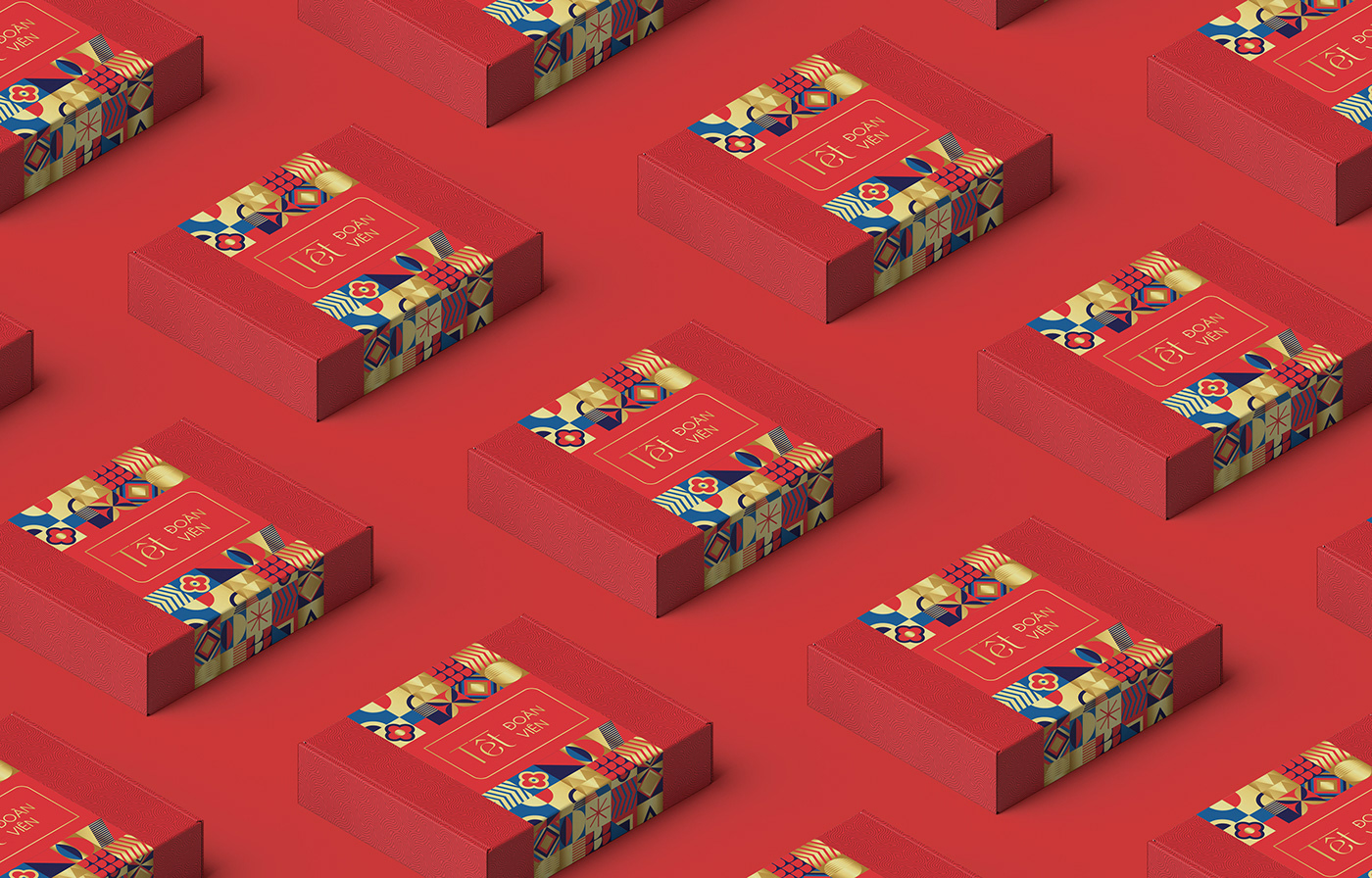
Products are emphasized by using modern simple shapes, these shapes show the features that every Tet holiday has: fireworks, cherry blossoms, apricots, cakes, jam.
The color added is because I feel that these 3 colors are combined without being sad, it creates a festive atmosphere,
The color added is because I feel that these 3 colors are combined without being sad, it creates a festive atmosphere,
high decor.
Attern is the place to create an accent on the imprinted pattern (this pattern represents the winding dragon image, it intertwines to show national solidarity, I can imprint or sink, I think This pattern should be imprinted to create an accent
Attern is the place to create an accent on the imprinted pattern (this pattern represents the winding dragon image, it intertwines to show national solidarity, I can imprint or sink, I think This pattern should be imprinted to create an accent
"both floating and sinking")
As for my own font, a little stylized to make it look modern but somewhat nostalgic… the font is also a highlight of this design.
As for my own font, a little stylized to make it look modern but somewhat nostalgic… the font is also a highlight of this design.


Concept & Designer: TakeTime
Photo: Unsplash, Dreamstime
Mockup: https://www.anthonyboyd.graphics/
THANKS FOR WATCHING!
If you like it, please follow me to see more new projects!


